Prop Firm Match · UX Director · 2025
Redesigning for trust in a broken industry
A strategic repositioning of a proprietary-trading comparison platform — pivoting from aggressive affiliate aggregator to trusted FinTech institution through a full site redesign, conducted in a single sprint with an AI-accelerated workflow.
View the prototype (opens in new tab)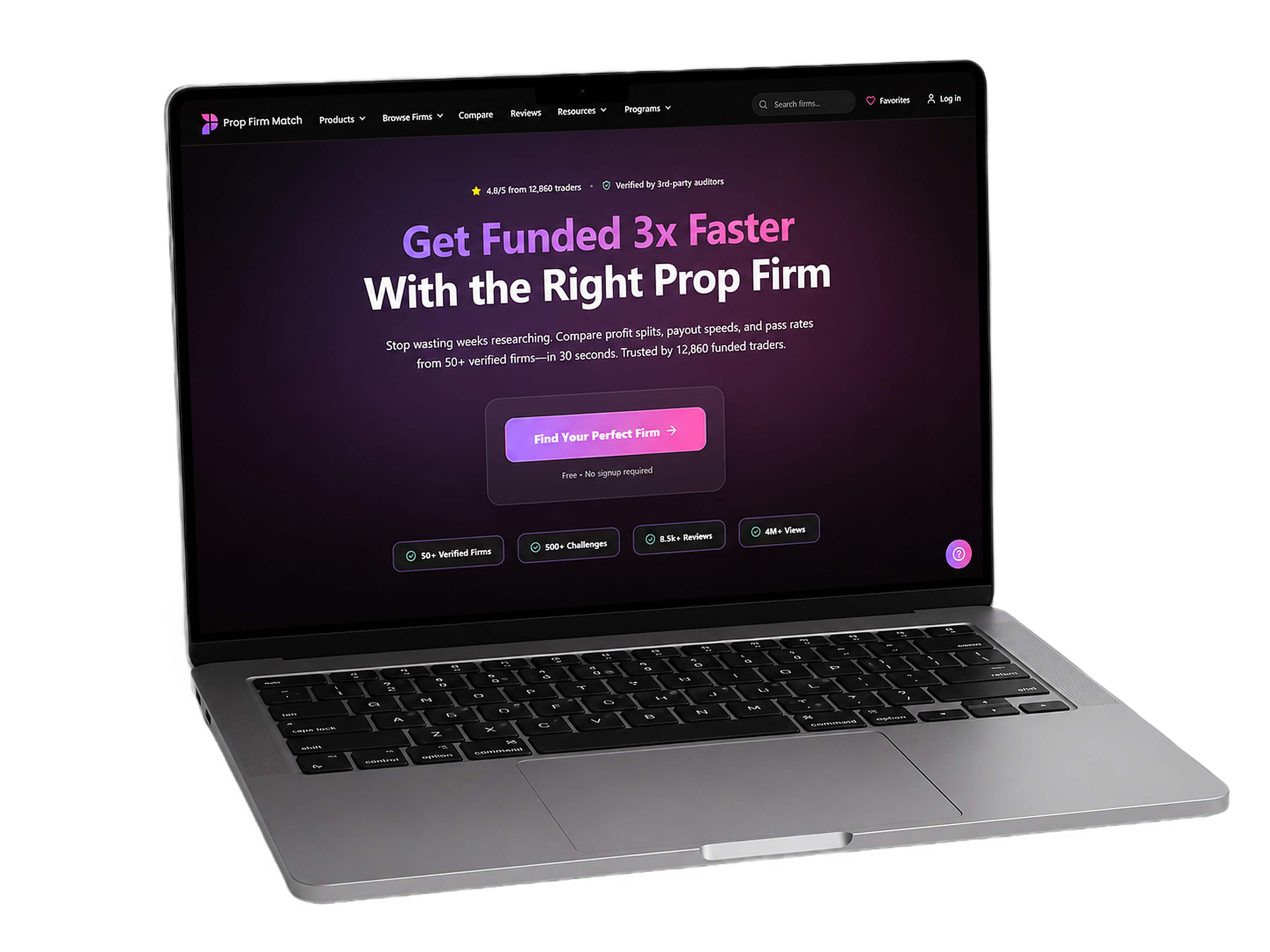 Fig. 01 / Redesigned homepage
§ 01
Summary.
Prop Firm Match (PFM) is a comparison aggregator for the proprietary-trading industry whose design was actively working against its core business objective: earning trader trust.
I ran a full heuristic, technical, and accessibility audit, built a research-backed persona framework, and prototyped a complete site redesign — with measurable improvements to visual clarity, accessibility, and conversion architecture across the user journey.
§ 02
Project overview.
Overview
PFM is a platform where retail traders research, compare, and ultimately purchase access to funded trading accounts across 50+ vetted firms. Its revenue model is affiliate commissions — which means trust isn’t a brand value, it’s the literal mechanism by which the business makes money.
Goal
Identify the highest-impact conversion opportunities, redesign the homepage and navigation for desktop and mobile, and produce a strategic rationale that could brief a design team. The deeper goal: make the case for repositioning from high-stimulation marketing site to the calm, trustworthy FinTech institution a skeptical trader would actually rely on.
§ 03
Understanding & defining the problem.
The proprietary-trading industry is in a trust crisis. Between 2024 and 2025, roughly 80–100 prop firms shut down — about 13–14% of all global operators — taking trader funds with them. Sudden closures, retroactive rule changes, and influencer hype have made traders deeply skeptical of anyone selling something. PFM’s positioning as the industry’s “bastion of truth” is an actual competitive moat — if the design can support it.
The audit revealed four areas where it currently can’t.
01 Fragmented navigation
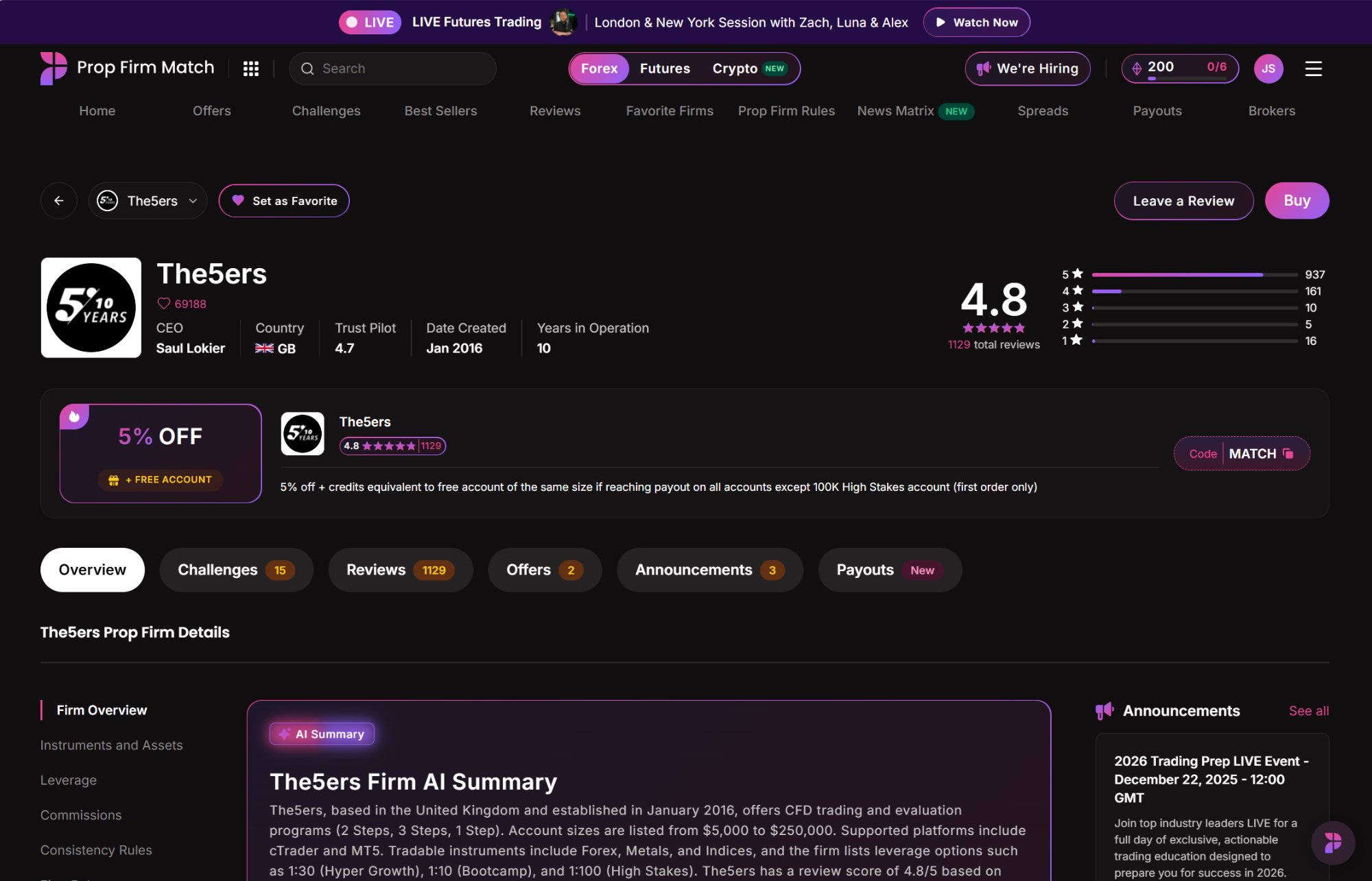
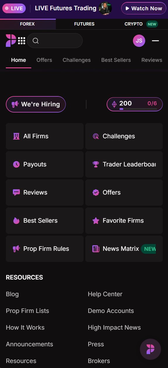
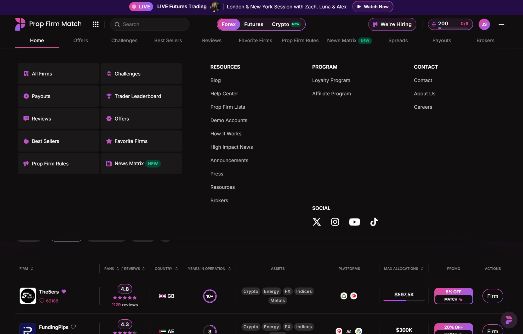
The site runs three competing navigation systems at once: 10 top-level links, a 3×3 grid, and a mega menu hidden behind a hamburger. Each tries to do the same job, so users work to build a mental model of where anything lives. High-value comparison tools are buried — and users who can’t find them assume they don’t exist. On mobile, the responsive logic simply scales the desktop down rather than rethinking it for a thumb-driven, variable-bandwidth context.
◀ Live site
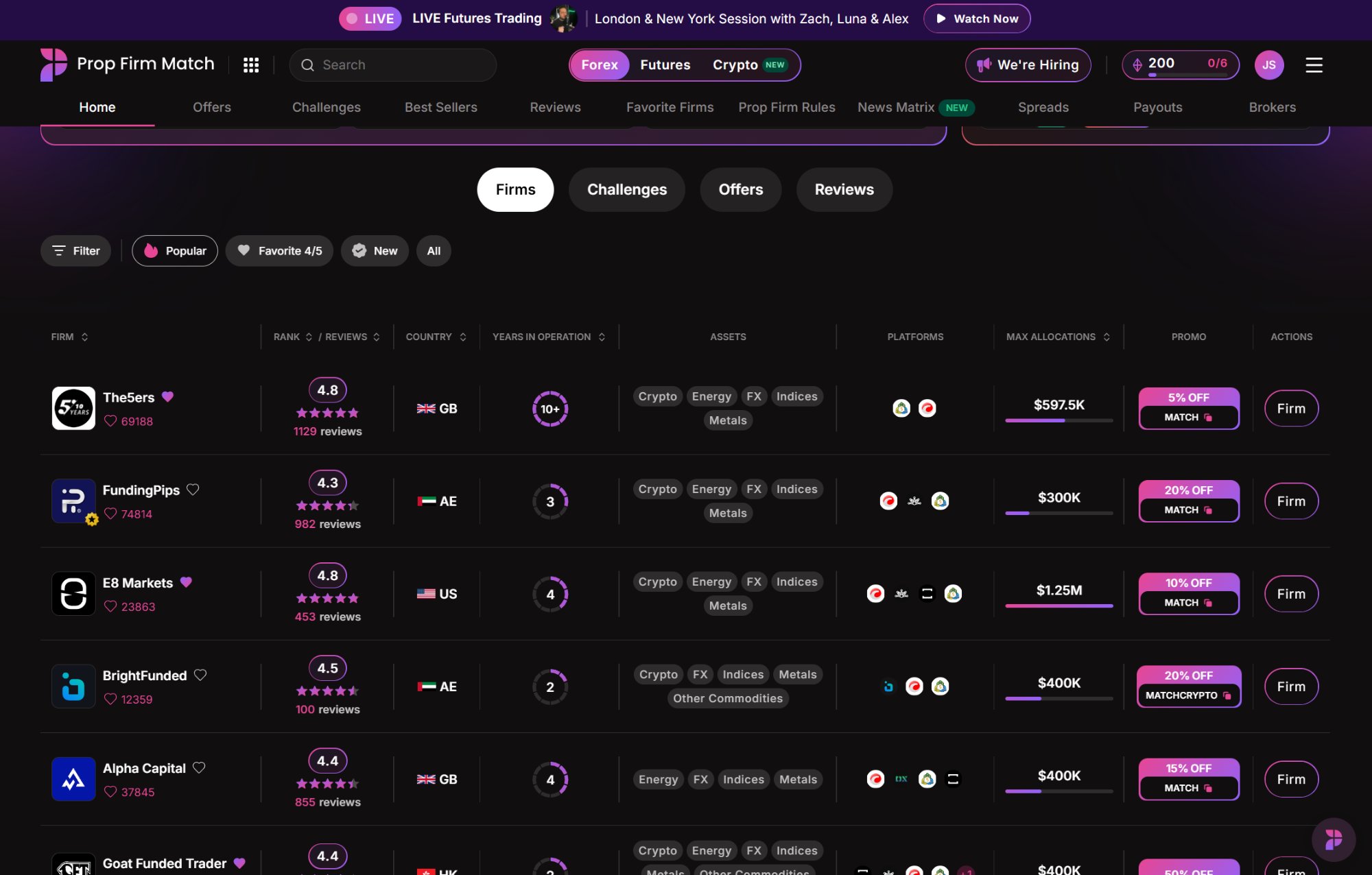
One of three competing menus, hidden in a collapsed icon, with two sections split into five columns of mixed logic.
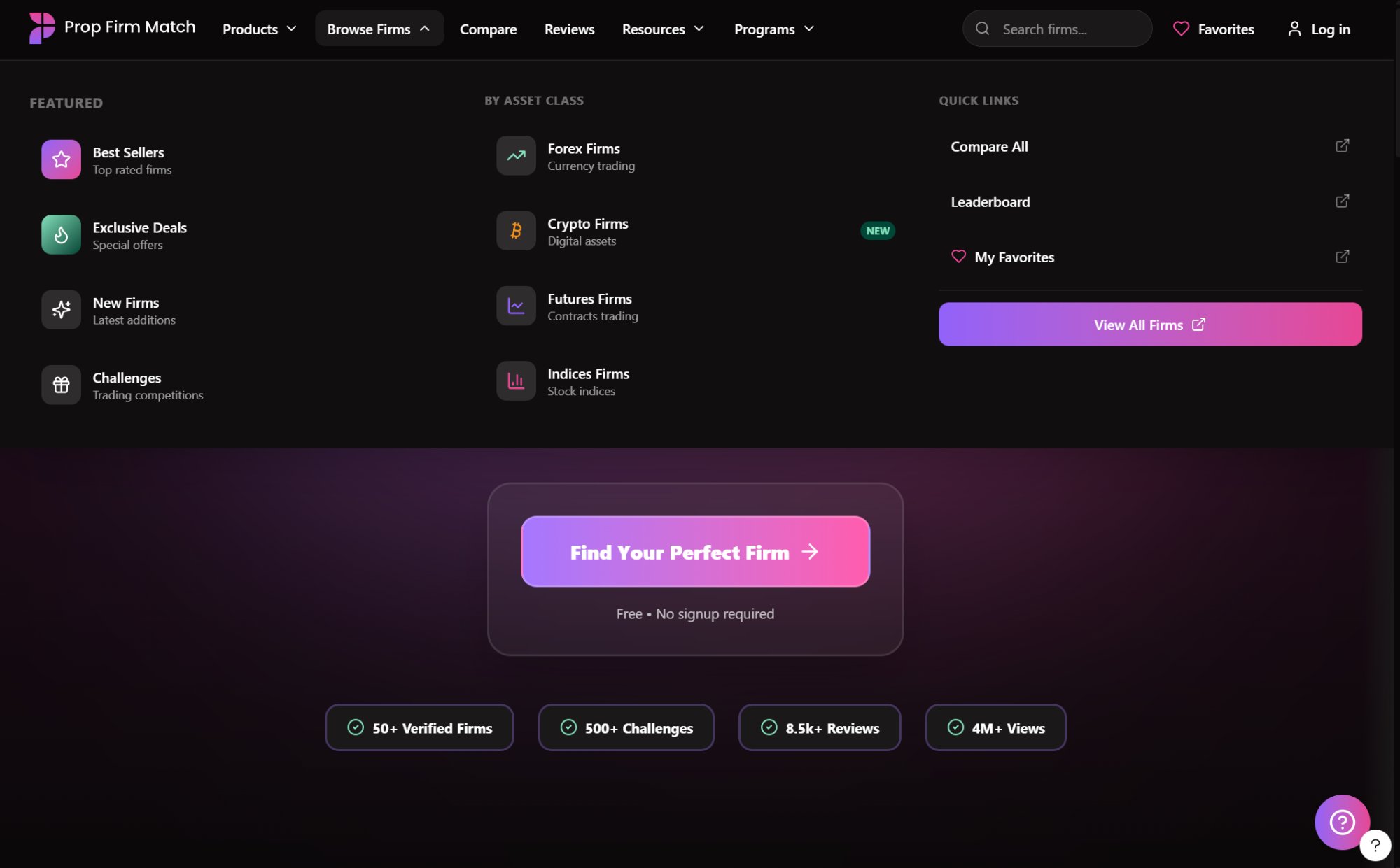
Prototype ▶
Intent-based mega menu — scoped to a single nav item and organized into three intuitive columns.
◀ Live mobile
Dense content on a small screen with multiple competing focal points.
Prototype mobile ▶
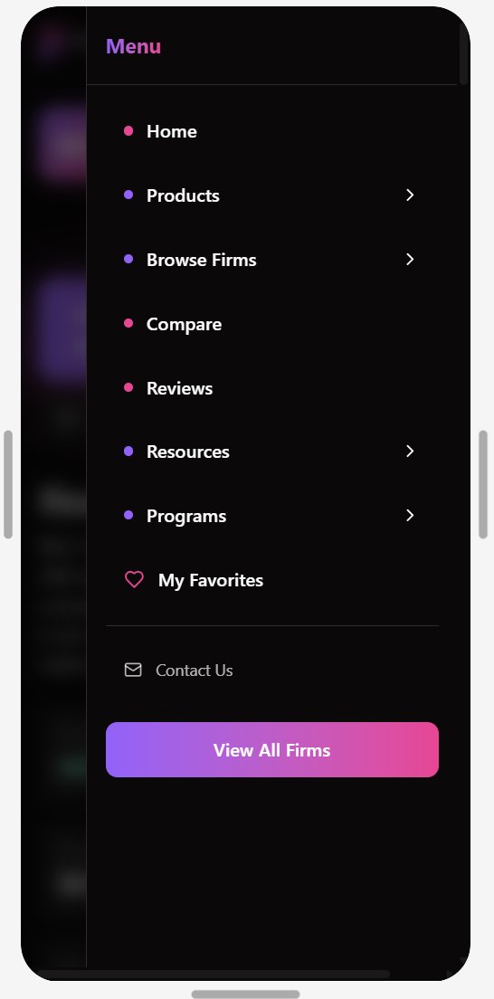
Clean single accordion — only one category open at a time, keeping focus on the task at hand.
02 The expert-bias hypothesis
Every metric label, comparison table, and filter is built for someone who already understands trailing drawdowns, consistency rules, and Martingale restrictions. Yet roughly 30% of users are new to trading — arriving from TikTok or Instagram after seeing a funded trader flex a payout. The site has no guided path for them: they land, can’t orient, and bounce. That’s an untapped segment with significant PLG potential — if they feel supported and succeed, they refer friends.
03 Trust-signal gaps
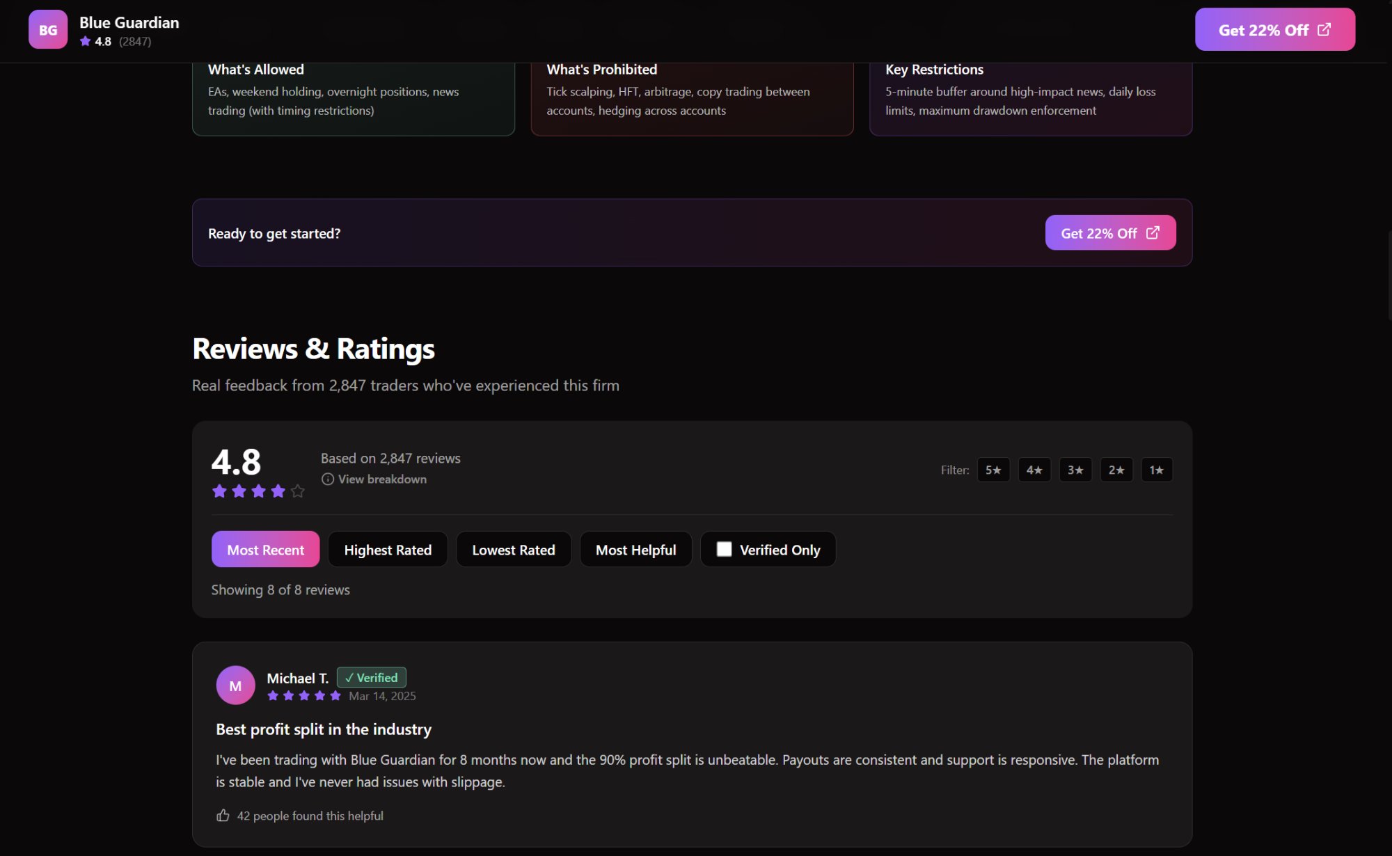
Time-pressured pop-ups, promotional overlays, and countdown banners signal — to a skeptical eye — that the platform optimizes for the commission, not the decision. Experienced traders know what an affiliate site looks like. The qualitative social proof that would actually move them — verified trader reviews, payout confirmations — is deprioritized below less decision-critical content. The data users most need is the hardest to find.
◀ Live site
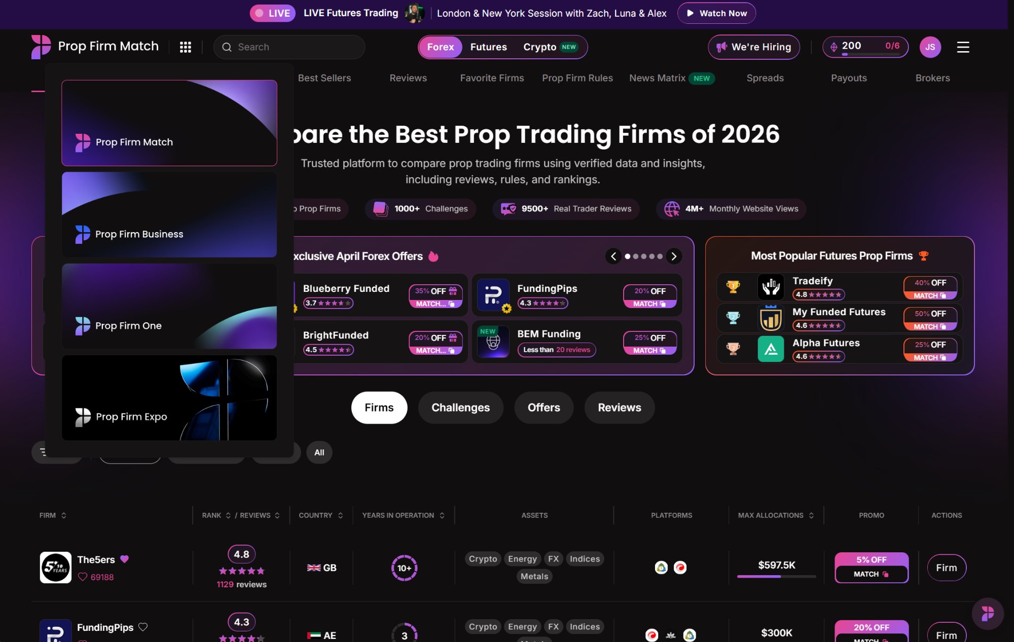
Firm profile — AI summary, sidebar nav, announcements column, and promotional banners all competing simultaneously.
Prototype ▶
Reviews & Ratings surfaced prominently with fast scroll, verified-trader filter controls, and a clean hierarchy focused on user attention.
04 Technical & accessibility failures
The live site scored 31 on PageSpeed Insights and 73 on Pingdom — meaningful for a platform whose largest user segments are in India, Nigeria, and South Africa on mobile data. A WCAG 2.2 audit returned an overall accessibility score of 41% — firmly in the “high lawsuit risk” band — with 166 critical failures across seven categories. A functional account-creation error also blocked every signup attempt during the audit: a conversion leak of unknown scope.
The personas
Before committing to a direction, I built three research-informed personas from demographic data to give the strategy a human anchor:
The Skeptical Veteran
The core demographic
28, Lagos or Mumbai, mid-tier Android on 4G, 3+ years trading CFDs. Returns repeatedly but hesitates to convert.
“I want to verify a firm’s payout reliability without aggressive sales tactics.”
The Eager Novice
The untapped opportunity
22, South Africa or Indonesia, smartphone-first, under six months trading. Arrived via social media. Needs a guided path in plain language.
“I want to understand what prop trading is and find the safest entry point without feeling stupid.”
The Trust-Seeking Analyst
High-value western minority
34, US or UK, higher purchasing power, 1–3 years trading CFDs and Futures. Active purchaser, deeply critical of affiliate bias. Needs radical transparency and qualitative data — not curated star ratings.
These three sit at different points on the funnel and have almost nothing in common — except that the current design fails all of them, in different ways.
§ 04
The process.
Faced with a compressed timeline, I replaced the traditional research pipeline with a structured AI-accelerated workflow — built around one principle: AI handles velocity, I handle judgment.
Multi-agent auditing via Cursor
I built a custom multi-agent workflow in Cursor and deployed it as a Figma plugin, assigning specialized agents — design thinking, engineering, usability, accessibility, marketing, PLG, business development — to audit screenshots of the live site in parallel. Their cross-domain consistency gave me confidence the core problems were real, and corroborated my own heuristic evaluation at a granularity that would have taken far longer manually.
Predictive eye-tracking via Attention Insights
To establish a quantitative baseline, I ran the live site through Attention Insights — an AI model trained on 550M+ human gaze points that produces simulated attention heatmaps. The results were stark:
| Metric | Before | After |
|---|---|---|
| Clarity (Homepage) | 41 — difficult | 71 — optimal (+30) |
| Clarity (Firm profile) | 30 — high difficulty | 56 (+26) |
| Focus score | 62 | 64 |
| Primary CTA visibility | Not registering | High-visibility zone |
A Clarity score of 41 means the page works against the user’s ability to process it; the firm profile at 30 is in disengagement territory, and the primary CTAs weren’t even registering as focal points. The prototype moved the homepage to 71 (optimal) and the profile to 56 — meaningful for a single-pass sprint, with clear room to refine.
Rapid iteration via Figma Make
I translated the strategy into a structured R.O.S.E.S prompt (Role, Objective, Scenario, Expected Solution, Steps) and used Figma Make as a co-designer to iterate on layout and components. The full accessibility report was fed in as direct context, so the 166 WCAG failures informed the prototype from the start rather than being addressed retroactively. I treated Figma Make as a fast option-generator, not an autonomous creative — every output was evaluated and edited.
Research synthesis via Claude & Gemini
Claude and Gemini served as research accelerators — mapping PFM’s business model and revenue mechanics, understanding the competitive landscape, and synthesizing demographic data, audit findings, and accessibility reports into a coherent picture. The thinking, the framework, and the design decisions were mine; the AI compressed research and presentation work from days to hours.
§ 05
The design decisions.
Every decision traces to a single thesis: PFM’s visual and structural identity needs to match its brand promise. It positions itself as the industry’s trusted authority — the design needs to look and feel like one.
The inspiration came not from direct competitors — uniformly high-stimulation, high-density interfaces that feel like they’re selling a dream — but from analogous FinTech platforms that already make complex financial data feel safe and institutional: Coinbase, Robinhood, NinjaTrader. They use whitespace deliberately and lead with hierarchy, not volume. That’s the mental model I imported.
“The goal was not to look like a prop-trading site. It was to look like the kind of platform a serious trader would trust with their evaluation fee.”
01
Top of funnel
The “Safe Start” onboarding wizard
The most important top-of-funnel move was a guided entry point for the 30% of users the current site has no path for. The “Find Your Perfect Firm” wizard translates complex mechanics into plain-language questions — not “What is your maximum drawdown tolerance?” but “How much are you comfortable risking to start?” — and progressively narrows to a recommendation that feels personal.
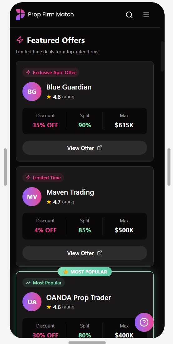
This is the PLG flywheel: users who feel supported through an intimidating decision come back and refer friends. The homepage CTA becomes the singular entry point, replacing the competing offers carousel.
Desktop prototype
“Find Your Perfect Firm” CTA as the singular conversion entry point, replacing the offers carousel.
Mobile prototype
The same CTA translates cleanly to a full-width button with trust signals above.
02
Consideration phase
A true comparison tool
PFM is, by definition, a comparison engine — yet it has no mechanism for actually comparing firms side by side. The Skeptical Veteran, trying to make a final call, is forced to rely on memory or juggle browser tabs to compare drawdown rules, consistency requirements, and payout timelines. That’s decision fatigue by design.
The solution is a sticky comparison tray that lets users select up to three firms while browsing, triggering a dedicated side-by-side view with key differences automatically highlighted. When users can independently verify the exact data they need without friction, they move faster from consideration to conversion.
◀ Live site
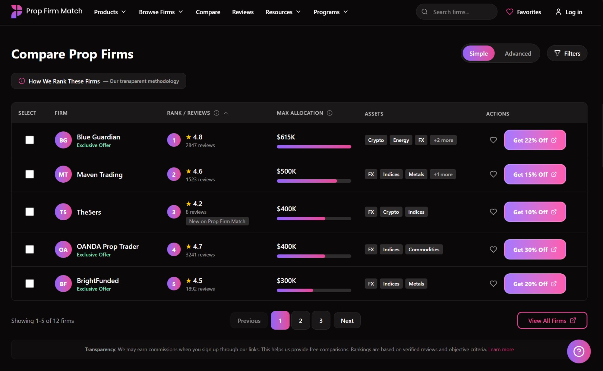
Dense 9-column table with no selection mechanism and no comparison flow.
Prototype

Checkbox selection mechanism to choose firms for comparison.
Prototype
Dedicated comparison table for quick review across selected firms.
03
Consideration → purchase
Flipped information hierarchy with progressive disclosure
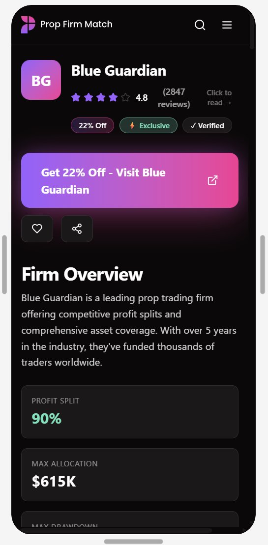
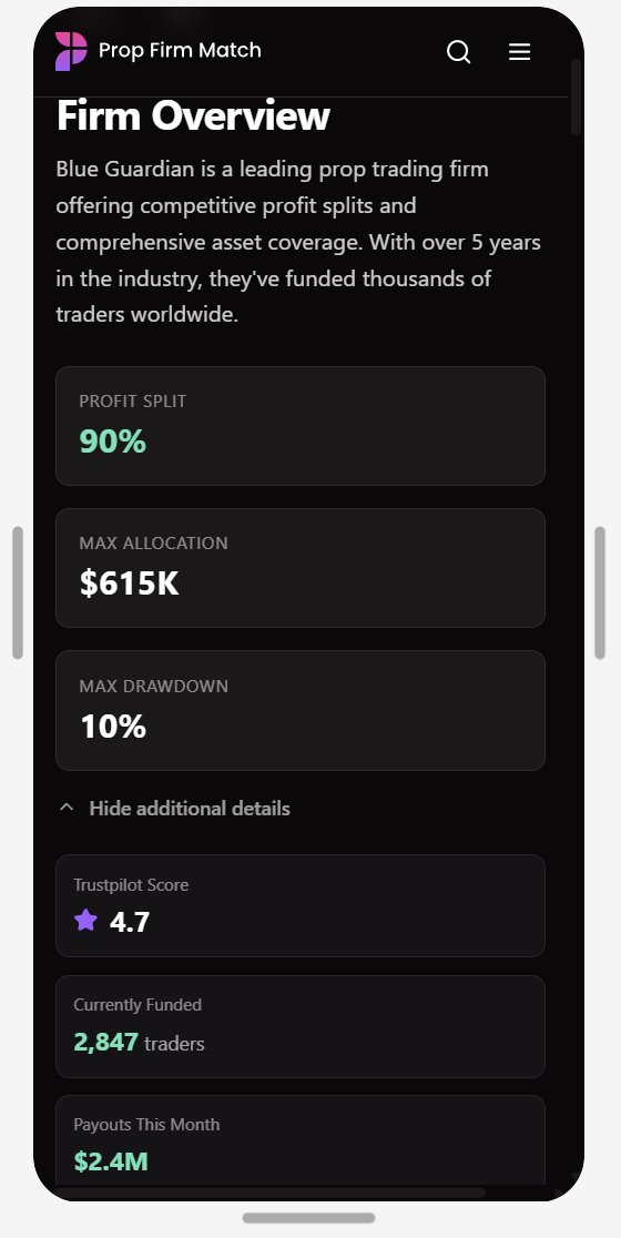
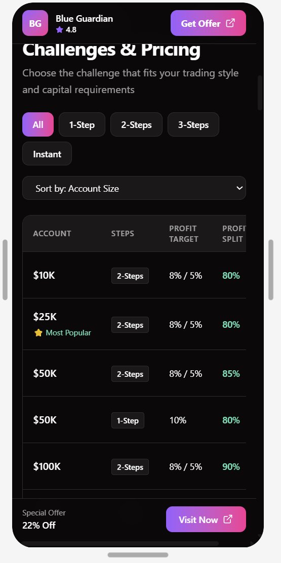
Firm profiles currently lead with the least decision-critical content — the AI summary is buried, trading rules are a wall of text, and the metrics that matter (profit split, max allocation, max drawdown) are lost in a dense dump. The redesign applies the inverted-pyramid principle from news publishing: most important information first, secondary detail on demand through accordions and collapsible sections. Inline contextual definitions give users the vocabulary to evaluate what they’re seeing without prior expertise.
◀ Live site
Firm profile — competing left sidebar, right announcements column, promotional banner, and dense data dump all simultaneously active.
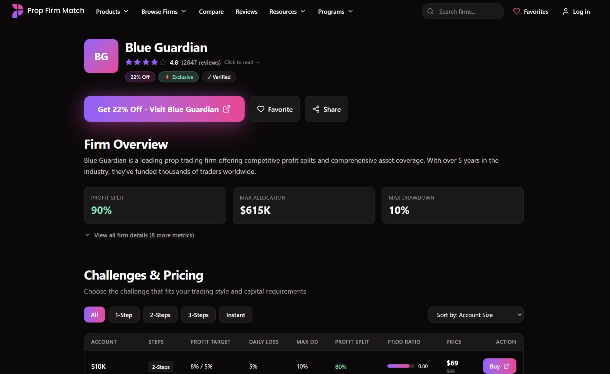
Prototype ▶
Profit Split / Max Allocation / Max Drawdown surfaced immediately; “View all firm details” progressive disclosure below.
◀ Live mobile
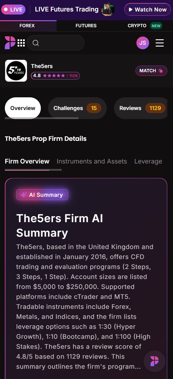
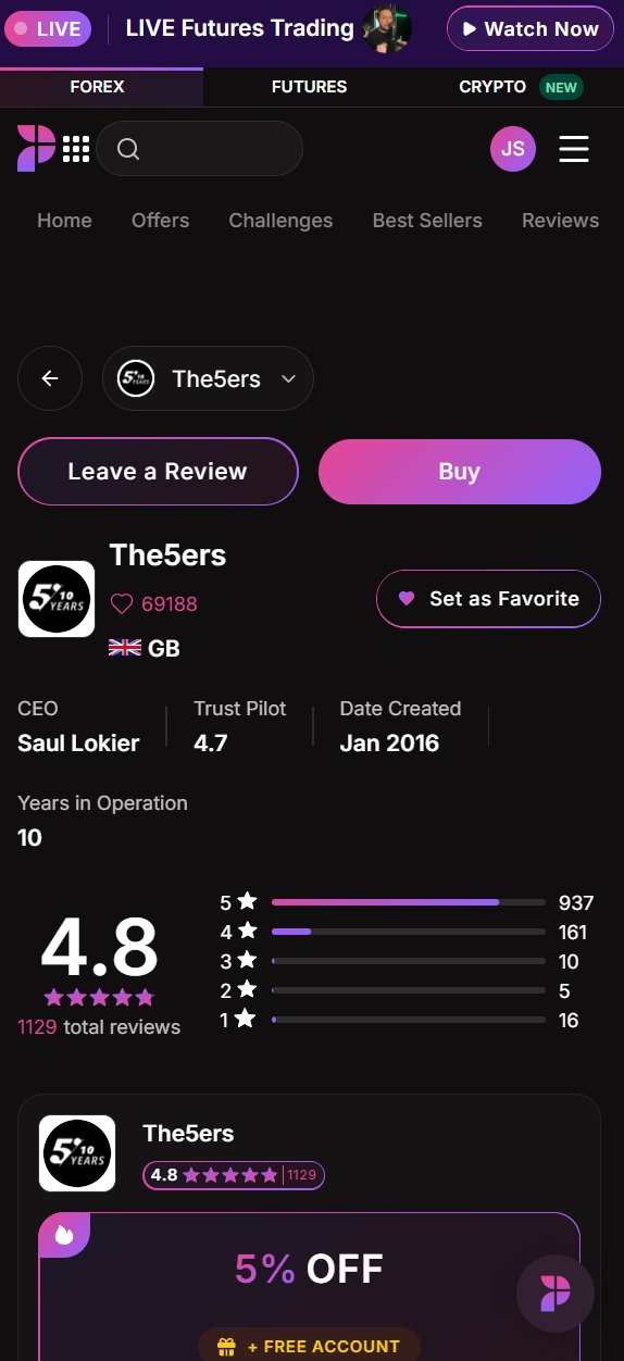
Significant screen real estate occupied by navigation, banners, and calls to action before firm content appears.
Prototype mobile ▶
Succinct firm overview with key stats above the fold, additional stats peeking out below.
◀ Live desktop
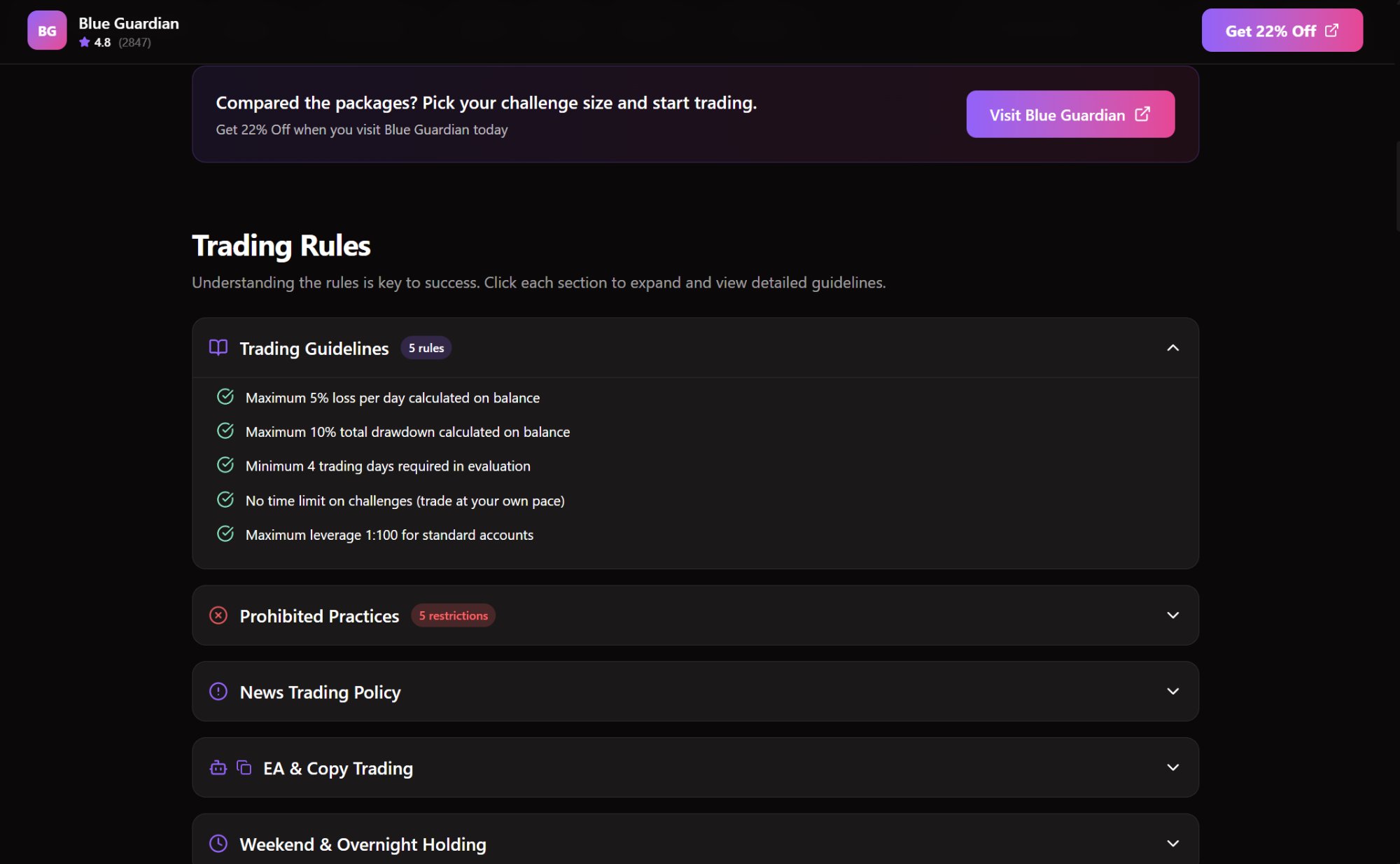
Trading Rules are a wall of text — not easily digested and likely to be ignored.
Prototype ▶
Trading Rules implemented as progressive disclosure accordions — full clarity without front-loading all detail.
04
Navigation architecture
From three competing systems to one intent-based architecture
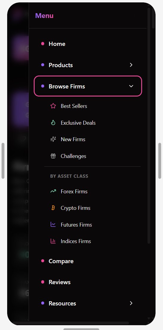
The triple-navigation system was reduced from 11 links to 8, consolidated into four intent-based categories: Products (sister-platform cross-sells), Browse Firms (all firm options, implicitly scalable), Resources (learning center, blog, help), and Programs (loyalty, affiliate, careers). On desktop, menus reveal on hover; on mobile, a single accordion with WCAG 2.2 AA touch targets gives users one system to learn rather than three.
The categorization is designed to scale — new firms slot under Browse Firms, new tools under Products, new content under Resources — without architectural rethinking. A nav that renders under 100ms and eliminates layout shift also improves Google ranking: the fix is a design, engineering, and SEO decision simultaneously.
Resources dropdown
Learning Center, Blog, Help Center, Demo Accounts, High Impact News, Announcements — educational content previously scattered across three nav systems, now unified.
Programs dropdown
Loyalty Program, Affiliate Program, Careers — clean separation from core product nav.
◀ Live mobile
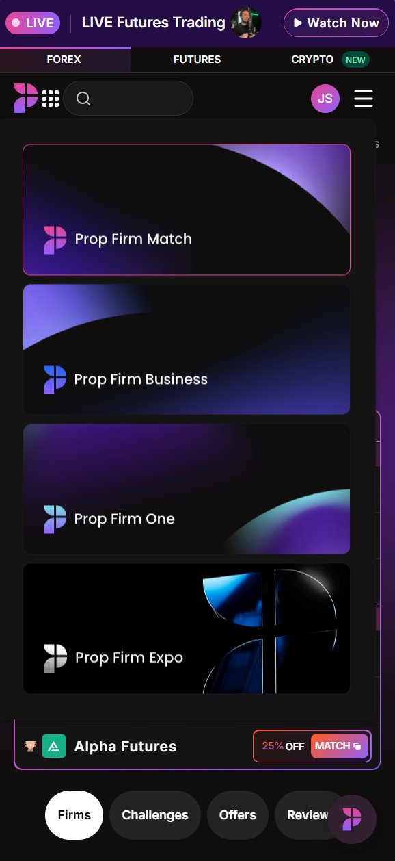
Products grid with card tiles, competing with bottom tab bar and hamburger menu simultaneously.
Prototype mobile ▶

Products accordion expanded — subcategories visible on tap, other sections automatically collapse.
§ 06
Results & impact.
41→71
Homepage Clarity — a 30-point lift into the optimal range, with CTAs now in high-visibility zones.
166
Critical WCAG 2.2 failures fed directly into the prototype as context — addressed, not postponed.
Firm-profile Clarity improved from 30 to 56 — out of high-difficulty territory — with room for further refinement over additional iterations. A site scoring 41% on accessibility isn’t just legal exposure; it’s a barrier to an entire category of users and to SEO in every market.
The strategic value goes beyond the scores: the redesign closes the gap between what PFM promises and what its design delivers. An industry in a trust crisis needs a platform that behaves like a trusted institution — not another affiliate site with a badge. The repositioning toward breathing room, progressive disclosure, and verified social proof is the difference between converting high-value skeptical users and losing them to whatever feels more credible.
§ 07
Learnings & next steps.
This engagement was, in context, a take-home design exercise — worth naming, because it informs what I’d do differently with more time and what the honest next steps are before any of this moves to engineering.
The most significant gap is the absence of generative user research. The personas are grounded in real demographic data, but they are hypotheses. Before heavy execution, I’d run five generative interviews per persona to validate assumptions and map real end-to-end flows — including the authenticated experience I couldn’t access due to the signup error.
I’d also approach Figma Make differently with more runway: ideate first — sketches, wireframes, rough flows — and feed those in as explicit context. These systems execute well on precise instruction but don’t innovate from a blank slate.
Proposed validation roadmap
- 01Persona validation interviews — five generative interviews per persona to validate assumptions and map real flows.
- 02Tree testing — stress-test the new navigation’s findability without visual cues.
- 035-second tests — does the homepage read as a financial platform or a marketing site in the first five seconds?
- 04Moderated scenario testing — observe users through the wizard, comparison tray, and firm profiles. Where do they hesitate?
- 05Phased rollout against guardrails — 1% → 5% → 25% → 50% → 100%, each gate tracked against seven guardrail metrics. A bad call at 1% is cheap; at 100% it isn’t.
The work here is a strong first pass at a genuinely hard problem. PFM has the right product in a market that needs what it offers — closing the gap between that promise and the current experience, for every type of user, is the work worth doing.
View the prototype (opens in new tab)