Prosper · UX Director
Shape: cutting design time by 90%
Architecting Prosper’s first enterprise design system — moving from fragmentation and technical debt to a single source of truth that accelerated the entire product development lifecycle.
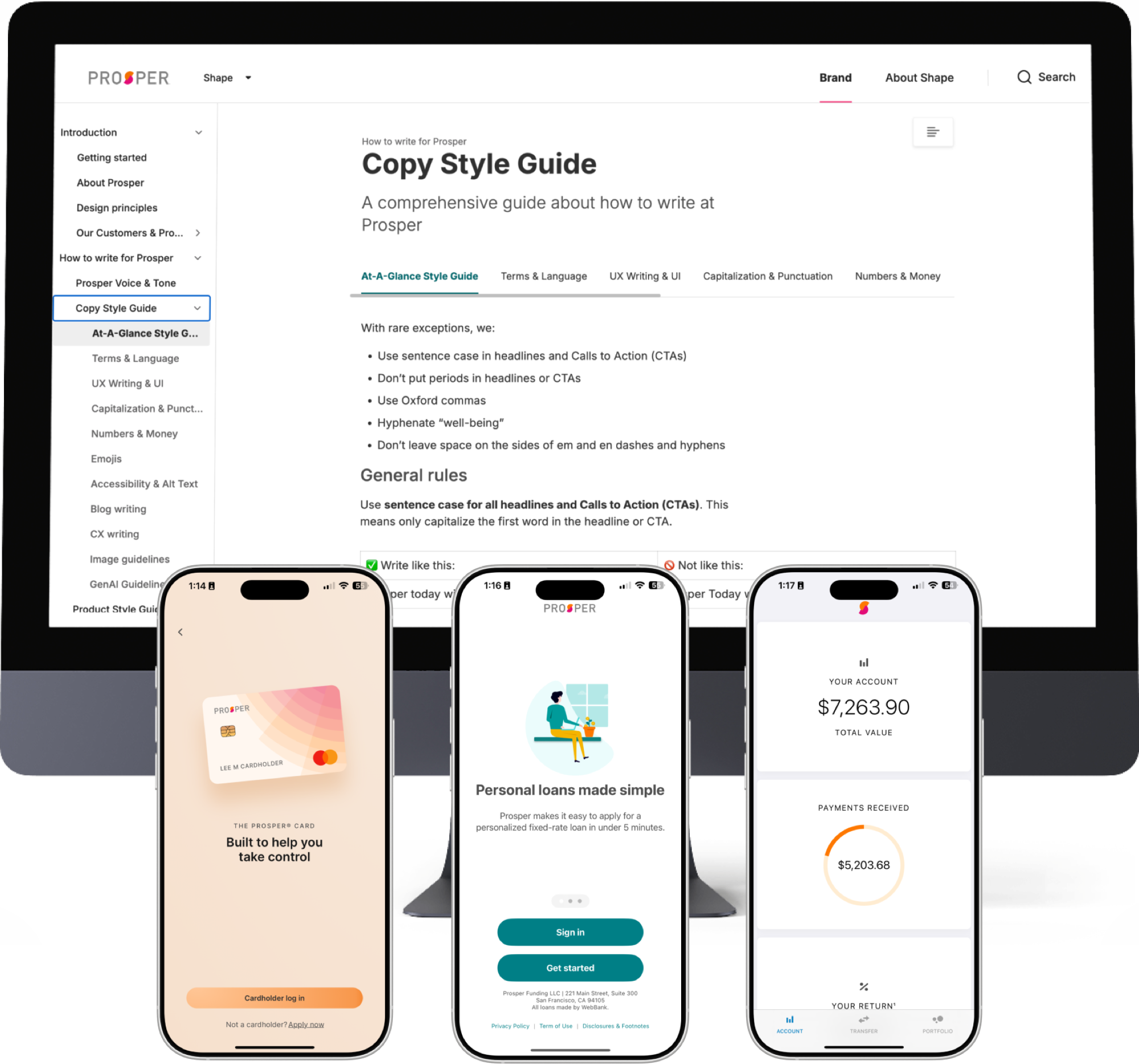 Fig. 01 / Design system
§ 01
Summary.
Prosper’s multi-product financial ecosystem was suffering from severe fragmentation and technical debt from siloed development. By building the Shape design system from the ground up, we defragmented the ecosystem and created an enterprise-wide asset that radically accelerated our product development lifecycle.
§ 02
Project overview.
Overview
Shape is Prosper’s first comprehensive enterprise design system, built to serve as the single source of truth for UI components, brand guidelines, and coded assets across all product lines.
Goal
Defragment the product ecosystem and create a single source of truth for design and code — enabling faster, more consistent development and establishing Shape as an enterprise-wide asset for UX, engineering, and product.
Responsibilities
Strategy and vision, aligning Shape with business goals, ecosystem auditing, usability testing, ROI modeling, securing buy-in and contractor resources, rearchitecting for scale, and technical integration with engineering (Figma MCP).
§ 03
Understanding & defining the problem.
Prosper’s products had grown rapidly to meet customer needs. But because each was built by different teams with little coordination, the user experience became increasingly fragmented.
This fragmentation manifested in three critical ways:
- Visual disparities: fonts, palettes, and icon sets varied wildly across products, watering down the brand.
- Technical debt: engineering constantly re-invented UI components, slowing development and inflating cost.
- User friction: returning users struggled to navigate different interfaces, hurting satisfaction and loyalty.
Compounding this was a severe resource imbalance. We ran roughly 20 engineers per UX designer — double the high end of agile best practice — alongside a staggering 50:1 ratio for researchers and content designers. My team spent at least 10% of its time just managing design and tech debt. Without a scalable system, that debt would only accrue.
§ 04
The process.
01
Defining the vision & the 8-month audit
We defined the system comprehensively: a pattern library, a documented style guide, a coded component library for developers, and a hub for brand mission and principles. Before I joined, the team had two competing versions — Shape 1.0, a reactive band-aid, and Shape 2.0, an aspirational vision — straining limited resources and achieving little. I retired 1.0 entirely and refocused us on 2.0, taking Shape from a pet project to a tool all of Prosper would depend on.
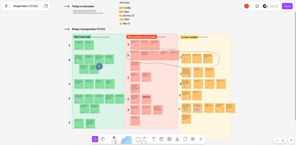
To build a true foundation, we spent eight months auditing ten years of design files — identifying every pattern across the ecosystem, methodically merging duplicates, and running usability tests to ensure unified components performed across all distinct user flows.
02
Capitalizing on year-end budget & the first business case
We secured a dedicated design-system contractor for three months by leveraging remaining 2023 budget that would otherwise have been lost, then built a formal business case to extend. Without long-term internal ROI data, we anchored the pitch in industry standards — Google, Salesforce, Shopify — and Forrester data showing a 671% ROI for design systems, alongside 37% savings in development time and an 18% quality improvement.
We projected conservative internal savings of $48,000 annually in UX labor and $55,000 in engineering — 44% time savings for designers, 20% for engineers (deliberately under-promising on engineering, since AI tools weren’t yet available to us). The data-driven pitch secured a six-month contractor extension.
03
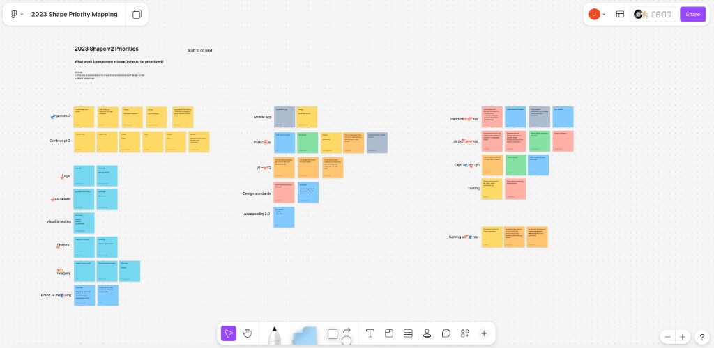
Rearchitecting the system for scale
With resources secured, we overhauled the architecture. Instead of one monolithic file, we split a Foundations file (colors, type, style variables) from a Components file (UI patterns), so minor token updates no longer required risky system-wide pushes.
We instituted rigorous governance: Figma branching and merging with semantic versioning (Major.Minor.Patch) and two required peer approvals before merge.
To drive adoption without breaking workflows, we used Figma modes — Legacy (outdated but widely used), Current (sporadically adopted), and Future (the new brand refresh) — so designers could adopt Shape tokens without sudden visual breaks.
04
Proving the value: the second business case
As the initial contract neared its end, we had internal data. We showed the contractor completed 15 new and rearchitected components in two months — work that previously took our overburdened team nine. To make ROI undeniable, we ran a live side-by-side timelapse: two designers built eight development-ready funnel screens using Shape in 30 minutes, a task that previously demanded half a day. With the contractor costing far less than a full-time senior Chicago hire, we secured another six months.
05
Upskilling the team & technical integration
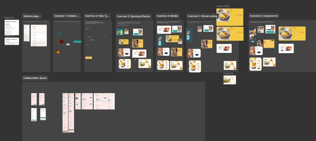
To scale into production, we leveled up the team’s Figma practice — auto layout, component properties, variables — and I worked with engineering to architect the system directly in code. Using Figma MCP for the first time, we created a direct 1:1 connection between Figma components and the React codebase, cutting design-to-code handoff time dramatically.
The UX manager accountable for Shape built a Cursor skill that scanned our Figma documentation and surfaced inconsistent tokens in seconds — a practical way to audit the system as it grew, catch drift early, and keep Shape maintainable even while the team stayed extremely lean.
§ 05
Final result & impact.
The results blew our conservative estimates away. Shape became the source of truth for the entire enterprise. On average, across departments, we cut project time in half — freeing the team for ~6 additional projects each, a 500% increase in productivity. Gains landed across every phase of the lifecycle:
25%
Less engineering time
Components connected via Figma MCP meant less UI rebuilding and faster shipping.
50%
Less QA time
Standardized components halved testing cycles and reduced miscommunication.
90%
Less design time
Centralized assets eliminated rework, freeing designers for high-level problem-solving.
100%
Brand cohesion
Unified type, components, and interaction patterns across all Prosper products.
§ 06
Learnings & next steps.
Building an enterprise design system is as much change management as design. Looking back, three lessons stand out.
Lesson 01
Delayed upskilling cost us time. Worried about morale on a thin, resistant team, I waited too long to push Figma best practices. By the time most of Shape was built, our product files didn’t use the new standards — so even though Shape was in code, we couldn’t leverage it until the team updated their files. We’re still making up for it.
Lesson 02
Engineering must be involved earlier. Partly a resourcing constraint, partly a miss: we underestimated how much we’d have to rearchitect components and variables to translate them cleanly to code.
Lesson 03
Trust, but verify your tools. We placed too much early trust in the platform — losing days to bugs that detached components when moving them between libraries, despite following Figma’s own migration docs.
Next steps
Shape is partially implemented in code via MCP, focused on a new mobile app that unifies our products into a single experience. As we expand across web, retire old stacks, and roll out the refreshed brand, the data will keep evolving. The priority now is continuously improving our Figma practice so the team can fully leverage everything Shape offers.